Designer with an architect's head and an artist's hands. I think in systems and sketch in the margins. Seven years of untangling complex products taught me that creativity is not decoration; it is structure you can feel. Strong opinions, always with receipts.

From 340B healthcare platforms to defense drone swarms to enterprise SaaS, I build design systems that scale and interfaces people trust. Lately I keep exploring how AI and AR/VR can make software more human.

Where I have worked PharmaForce · Brane Enterprises · Psynik Solutions · IIT Bombay (PGP-D)

Learnings · Field notes

Strong opinions, receipts attached.

Note 01

“Trust me, outline icons are best.”

The receipt: The PharmaForce component library standardized on outline icons across fifty component types.

The tradeoff: Outline icons can cost recognition speed at small sizes. In a dense claims UI, the lighter visual weight kept tables scannable, and that was worth the trade. Solid variants stayed reserved for active states.

Note 02

“Users feel FOMO missing info in a big table.”

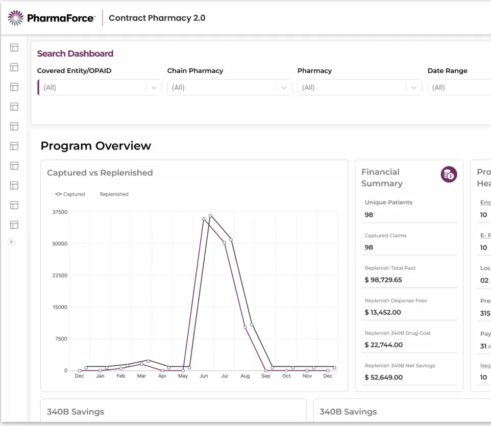
The receipt: The 340B claims tables kept their column density. Summary widgets went on top instead of stripping columns out.

The tradeoff: Density fights scannability. Cutting columns felt cleaner but tested worse: analysts distrusted "simplified" views. Progressive summarization beat subtraction.

Note 03

“Users like a huge flow broken into steps.”

The receipt: The Bulk Payor Upload wizard split one dreaded task into three steps: template, upload, review.

The tradeoff: More steps means more clicks. Even so, bulk upload time fell from 2 hours to 10 minutes. Steps cost clicks; they buy certainty.

Note 04

“People love an extra analysis step on failure more than success.”

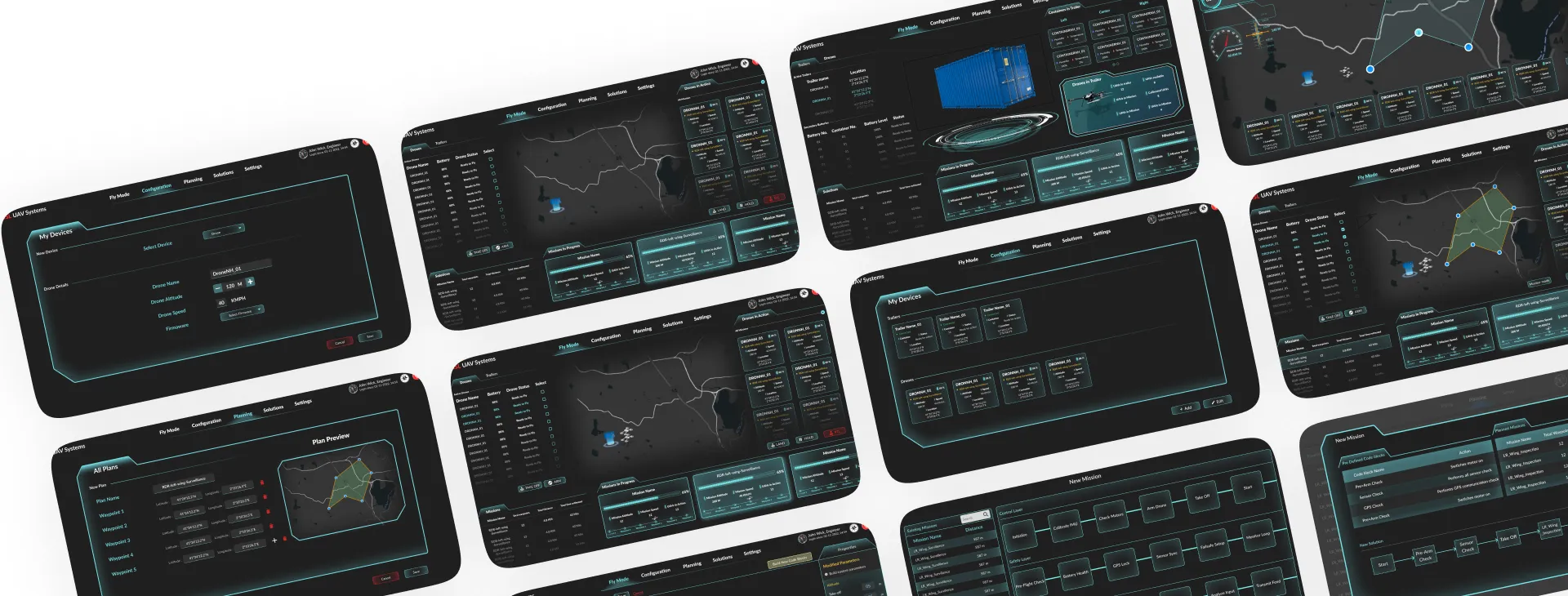
The receipt: Swarm UX added confirm-with-delay to destructive drone commands, and the upload review screen itemized every invalid record.

The tradeoff: Friction on the happy path annoys; friction at the failure point reassures. Error clicks dropped 60% in testing after the pause was added.

Note 05

“If users ask where their download went, the design failed.”

The receipt: The PharmaForce export wizard got live progress toasts and a re-download history panel. Tickets asking where files went fell 70%.

The tradeoff: Ambient status can become noise. The toasts earn their place by appearing only while something is actually happening, then getting out of the way.

Note 06

“Good defaults beat clever settings.”

The receipt: The configuration wizard shipped with smart defaults for frequency, dates, and claim types. Users completed report setups with zero mis-configurations on first try.

The tradeoff: Defaults can hide power from experts. Every default stayed one tap from its full control, so speed never cost capability.

System thinking · The method

Systems are kings. Here is why.

A one-off fix solves a screen. A system solves every screen that has not been designed yet.

At PharmaForce, seven tools each carried their own buttons, tables, and layouts, so users re-learned the product seven times. One shared library replaced all of it. QA rounds per feature fell from 5 to 1 or 2, and releases grew from 2 to 5 features a month.

Good design is a system pretending to be simple.

My go-to architecture

  1. Tokens: color, type, spacing as data
  2. Components: fifty types, every state named
  3. Patterns: wizards, tables, feedback loops
  4. Journeys: end-to-end, across all seven tools

My journey · Opt-in story

From machines to meaning.

  1. 0 – 20

    The engineer who kept sketching

    Mechanical engineering at B.V. Raju Institute of Technology. Machines taught me tolerances and constraints; the sketchbook kept asking why the machine’s interface felt like an afterthought.

    Constraints are not the enemy of creativity. They are its syllabus.

  2. 20 – 23

    The pivot

    End-to-end client design at Psynik Solutions, spanning e-commerce, EdTech, hospitality, and fitness, then a PGP-D at IIT Bombay to turn instinct into discipline.

    Breadth first, then depth. Every industry sharpened a different edge.

  3. 23 – 25

    Machines that fly

    Ground control systems for robotics, drones, and agriculture at Brane Enterprises. Modular design systems built from scratch; operator training time cut by 35%.

    Design for stress, not just use. In the field, calm interfaces save missions.

  4. 25 – now

    Systems at scale

    Senior UX at PharmaForce: an enterprise design system covering 95% of UI components across a compliance-heavy 340B healthcare platform, cutting development cycles by 60%.

    Systems thinking beats screen thinking. One source of truth, seven products.

Contact · Say hello

Let’s make something obvious.

Complex platform? Mission-critical tool? A design system that needs taming? I am one message away, and I text back fast.